 |
| Before (yuck) |
My 3-bedroom, 2 bathroom condo was built in 2000, and when I bought it and moved in back in the fall of 2015, I knew immediately that I'd eventually want/need to make some changes to the master bathroom. At some point during its life, previous owners gave this bathroom a few updates. I think someone removed a bathtub/shower combo and put in a vinyl shower insert, the toilet was replaced, and an appallingly large 3-section medicine cabinet was put up. After the first few nights of bonking my head on the cabinet every time I bent down to brush my teeth or wash my face, I knew it would have to go. But not right away. It wasn't until the plastic and rubber parts of the original builder-grade faucets started to disintegrate that I decided to make a change. So really, this all started with faucets. IT ALL STARTED WITH FAUCETS.
 |
| My dad, the tile-demo expert |
I wanted to replace the faucets, but I didn't really want to just replace them with new low-spout faucets that would fit under the stupid medicine cabinet, so I started thinking about higher spouts, which led me to look at widespread faucets instead of center-set. And that led me to consider a new countertop and sinks. At that point I was leaning toward keeping the cabinet and having it painted. But I really despised the pinkish-tan floor tiles that looked very dated to me and hadn't held up all that well in the last 17 years. When I discovered that the pinkish tiles ran under the cabinet, the project got a whole lot bigger.
 |
| This is when I realized a plumber needed to cut and cap all the supply and drain lines before I could remove the old cabinets. Unexpected expense! |
So where did I end up? New floor tile, cabinet, countertop, sinks, faucets, mirrors, light fixtures, cabinet hardware, wall paint, baseboards and shoe molding, and switchplate covers just for the heck of it. The only things I haven't changed are the towel bars (which I bought last year), toilet (replaced by previous owners and totally fine), and shower. My long-term plan is to remove the shower insert and have it all tiled and new frameless doors installed. For now, it's totally acceptable -- and it's tucked back into the corner of the bathroom, so it's easy to ignore. It just wasn't in my budget right now, and I couldn't handle making any more choices and arranging the work.

After demo, the first new thing to go in was the tile floor. My vision from the start was to make the room bright, crisp, and clean. I considered large porcelain tiles, but the small mosaic design had been in my mind the whole time, and I ended up going with white and gray octagon-and-dot tiles. These came from Lowe's, but I saw the same tile available in a few other stores. I chose white grout and was assured that this particular grout is high-quality and repels dirt and staining. Fingers crossed!

I kept my cat Frannie out of the room while there was exposed concrete and pipes, so she was surprised by the feel of the mosaic tile on her paws when I finally let her back in. The new Shaker-style gray cabinet is Waypoint in Stone. I chose gray versus a white cabinet so that it would provide more contrast with the tile floor. And with a light countertop, I think it all works well together. The cabinet hardware is Kohler. I worked with a local kitchen and bath store for the cabinet, countertop, and sinks. I found the chrome hardware at another design/plumbing supply shop in town.

This photo is the best representation of the light and how everything looks in the room. The countertop is Viatera Minuet quartz, and I chose white rectangular under-mount sinks. Initially, I thought I wanted a more subtle white quartz with little to no veining. But when I saw the large display slab on the wall at the stone shop and held a cabinet door up to it, I really liked the look of this one. My mom and I agreed that the veining was interesting but not overpowering and a good complement to the cabinet and tile.
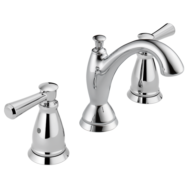
This whole project started with the need for new faucets, and these were so hard to choose! I looked at every faucet I could find, at every plumbing supply store in town, and I still wasn't thrilled with my choices. I couldn't find anything that was just right, and I finally settled on this Delta Linden widespread faucet. The spout was fine, but I didn't love the handles that I saw in the store -- and then I realized that there was a different handle design option available. I greatly preferred the handle you see above, so all in all, I'm happy with these faucets.

The rectangular mirrors with a beveled frame are from Lowe's. The mirror size and shape was another difficult decision (pivoting? framed? oval? rectangular?), but these turned out to be perfect. The round rugs with a little crocheted edge detail are from World Market (and they come in a variety of colors).


And finally, these aren't the greatest photos, but new light fixtures made such a difference in the space. The vanity fixture is from a local lighting store and is actually the first thing I bought for the renovation. I despised the curvy fixture it replaced and couldn't wait to see it go. The flushmount on the ceiling is the second one I tried. The first one was an LED that looked too much like an oversized tap light to me. So I tried this Pottery Barn Hayden Flushmount in satin nickel finish, and it's perfect.
One last thing -- the wall color is Sterling White by Sherwin Williams. It's a pale gray -- definitely more sterling than white -- complements the grays in the tile and cabinet but is still bright enough to bring lightness to the room.